 |
The upper-case 'Q' tail touches the circle.
|
 |
The '$' (dollar) has a single line which does not cross the 'S'.
|
 |
The '&' (ampersand) looks like 'Et' with a gap at the top.
|
 |
The diagonal strokes of the upper-case 'K' meet in a 'T'.
|
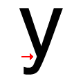 |
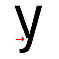
There is a smooth join at the junction of the lower-case 'y'.
|
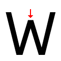 |
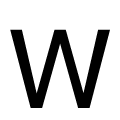
The centre vertex of the upper-case 'W' is below the outer strokes.
|
Note that the fonts in the icons shown above represent general examples, not necessarily the two fonts chosen for comparison.
Show Examples
 |
The upper-case 'Q' tail crosses the circle.
|
 |
The '$' (dollar) has a single line crossing the 'S'.
|
 |
The '&' (ampersand) is traditional style with a gap at the top.
|
 |
The diagonal strokes of the upper-case 'K' connect to the vertical via a horizontal bar.
|
 |
There is a break at the junction of the lower-case 'y'.
|
 |
The centre vertex of the upper-case 'W' is level with the outer strokes.
|