 |
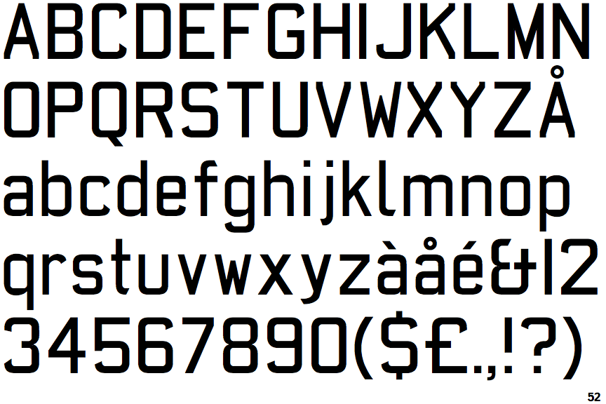
The upper-case 'Q' tail touches the circle.
|
 |
The '&' (ampersand) looks like 'Et' with a gap at the top.
|
 |
The centre vertex of the upper-case 'M' is on the baseline.
|
 |
The upper-case 'J' has no bar.
|
 |
The upper-case 'A' has tapered verticals.
|
 |
The upper-case letter 'I' is plain.
|
 |
The centre strokes of the upper-case 'W' meet at a vertex.
|
Note that the fonts in the icons shown above represent general examples, not necessarily the two fonts chosen for comparison.
Show Examples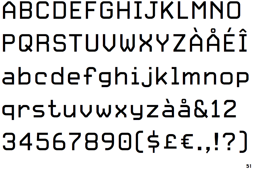
 |
The upper-case 'Q' tail crosses the circle.
|
 |
The '&' (ampersand) is traditional style with a gap at the top.
|
 |
The centre vertex of the upper-case 'M' is above the baseline.
|
 |
The upper-case 'J' has a bar both sides.
|
 |
The upper-case 'A' has parallel verticals.
|
 |
The upper-case letter 'I' has serifs/bars.
|
 |
The centre strokes of the upper-case 'W' form one centre stroke.
|