About Tungsten Font Family
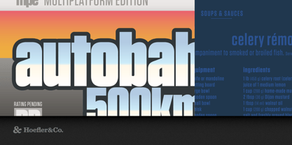
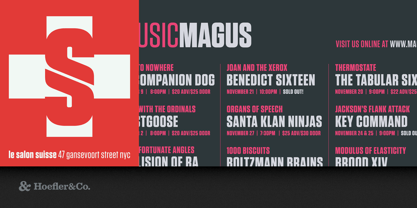
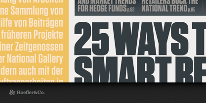
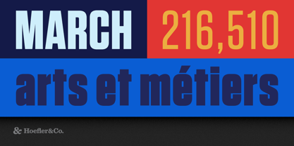
That rarest of species, Tungsten is a compact and sporty sans serif that’s disarming instead of pushy — not just loud, but persuasive.
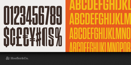
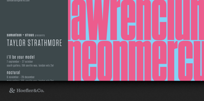
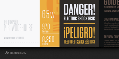
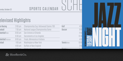
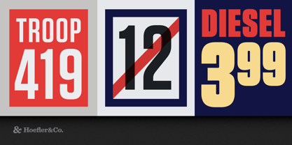
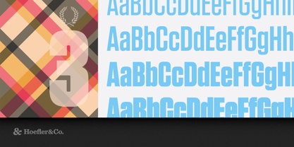
The Tungsten typeface was designed by Tobias Frere-Jones with Jonathan Hoefler in 2003. A family of compact, modular sans serifs, Tungsten works in a style colorfully known to sign painters as ‘gaspipe lettering.’ First appearing on the Bravo television network in 2004, Tungsten’s four weights were expanded into a broader set of thirty-two styles in 2012.
From the desk of the designer:
Flat-sided sans serifs have been a vital part of graphic design since its very beginning. Like many of typography’s loveliest styles, these letters are an import from sign painting, where the style — doubtless because its kit of lines and curves resembles plumbing — is colorfully known as “Modern Gaspipe.” These modular letters were an important part of the twentieth century poster, bright and optimistic in the propaganda of the Works Progress Administration (WPA), and peremptory in the Constructivism of the young USSR. In the service of any agenda, what these letters always signified was modernity, industry, and zeal.
Typographers have explored this compact modular style with mixed results. Typefaces that stay true to Depression-era forms run the risk of becoming nostalgic, forever evoking the sentimental Americana of tuxedo jackets and automats. Other designs, if they stick more doggedly to the underlying principles of rule and compass, often reveal how monotonous a typeface can become when restricted to too meager a kit of parts. Many such designs quit the fight when the going gets rough, abandoning their own internal rules when unruly letters like S or Ywon’t conform to the grid — a frailty that’s especially unwelcome in this kind of typeface, whose square-jawed ruggedness would otherwise recommend it for action movies and airport paperbacks.
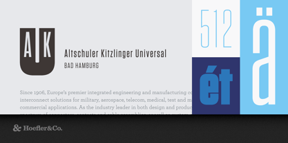
We started wondering if there was a way to make a typeface in this genre that was disarming instead of brutish, one that employed confidence and subtlety instead of just raw testosterone. It was an unusual design brief for ourselves, completely without visual cues, instead trading in cultural associations: “more Steve McQueen than Steven Seagal,” reads one note; “whiskey highball, not a martini” suggests another. We decided to reduce the letterforms not to circles and squares, but to a manageable set of stated interrelationships — between inside and outside, uppercase and lowercase, and one letter and the next — that could be applied with equal consistency throughout the design. The result is Tungsten, a family of high-impact fonts that doesn’t sacrifice wit, versatility, or style.
Tungsten®
is a registered trademark of The Hoefler Type Foundry, Inc.
About Hoefler & Co.
Famous for designing long-lived typefaces marked by high performance and high style, Hoefler&Co creates the fonts that give voice to the world’s foremost institutions, publications, causes, and brands. With a library of 1,500 fonts designed for print, web, office, and mobile fonts, Hoefler&Co is everywhere. Their typefaces shaped the presidential campaigns of Barack Obama and Joe Biden; they’re on the cornerstone of One World Trade Center and on every iPhone ever made. They serve brands from Delta Air Lines to Tiffany & Co., publications from Harper’s Bazaar to The New York Times, institutions such as the Guggenheim Museum, The Public Theater, and New York University, and non-profit organizations including the Natural Resources Defense Council, the Southern Poverty Law Center, and The Peconic Land Trust. The Premium foundry page can be viewed Here.
Read more
Read less