Select this license type when you are developing an app for iOS, Android, or Windows Phone, and you will be embedding the font file in your mobile application's code.
Zart
by DSType
Individual Styles from $40.00
Complete family of 3 fonts: $90.00


Zart Font Family was
designed by
Pedro Leal and
published by
DSType. Zart contains
3
styles and family package options.
More about this family
- Aa Glyphs
-
Best ValueFamily Packages
- Individual Styles
- Tech Specs
- Licensing
Per style:
$30.00
Pack of 3 styles:
$90.00
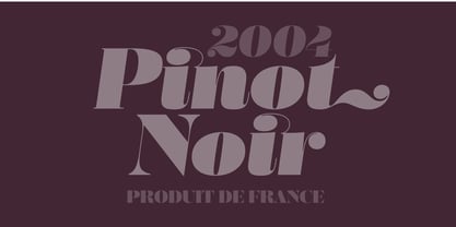
About Zart Font Family
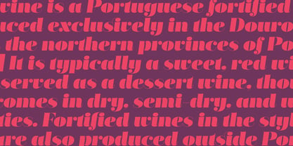
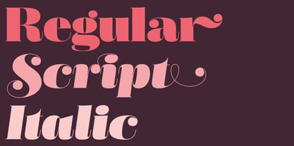
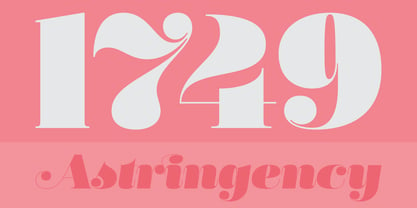
Zart is a heavy yet delicately sensitive display typeface filled with character, a free interpretation of the classical French styles from the late eighteenth century, reimagined for modern use. While it’s vertical strokes carry the typical weight of this style, the thinness of the horizontal strokes is further extended into the characters with the introduction of large vertical ink traps. This allowed us to design slightly narrower letters which, coupled with shorter serifs, result in a overall darker expression, creating really impactful headlines. Zart is available in three versions: Regular, Italic and Script.
Designers: Pedro Leal
Publisher: DSType
Foundry: DSType
Original Foundry: unknown
Design Owner: DSType
MyFonts debut: Dec 16, 2021
Zart
About DSType
“I began designing typefaces in the early ’90s because there weren’t many typefaces available to us in those days,” Dino dos Santos, founder of DSType, said in his Creative Characters interview. “I started designing fonts that matched the new typographic experience. To me, graphic design was never about taking a picture and then just choosing one of the available typefaces” Based in Porto, Portugal, Dino got his start designing typefaces for magazines and large corporations. Frustrated that the only fonts available for use were system fonts and dry transfer sheets, he began selling his typefaces on MyFonts. Since then, the self-taught designer has created a library full of striking experiments, charming display type, and most notably, an amazing collection of well-wrought, extensive text families. His collection also boasts a handful of bestsellers such as Velino Text, Prelo Slab and Prumo Slab. “There is not much of a type design history in Portugal,” he noted in his interview. He is, however, interested in what has been done in his country by older generations of type designers and calligraphers. “I want to understand what happened, how things worked back then, and expose the world to some lesser-known work. History is often seen as something that passed away, and that’s it. But for me history is one of the most relevant aspects of type design. I believe we are made of history, but also that we should take a step forward by connecting it to the present and the future and we can do that through technology.”The Premium foundry page can be viewed Here.
Read more
Read less
- Choosing a selection results in a full page refresh.