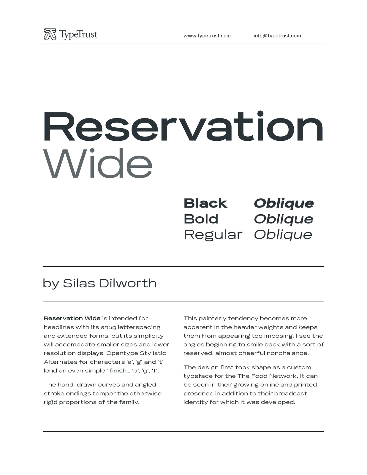
Reservation Wide by Silas Dilworth, 6 fonts, $30 to $160

About
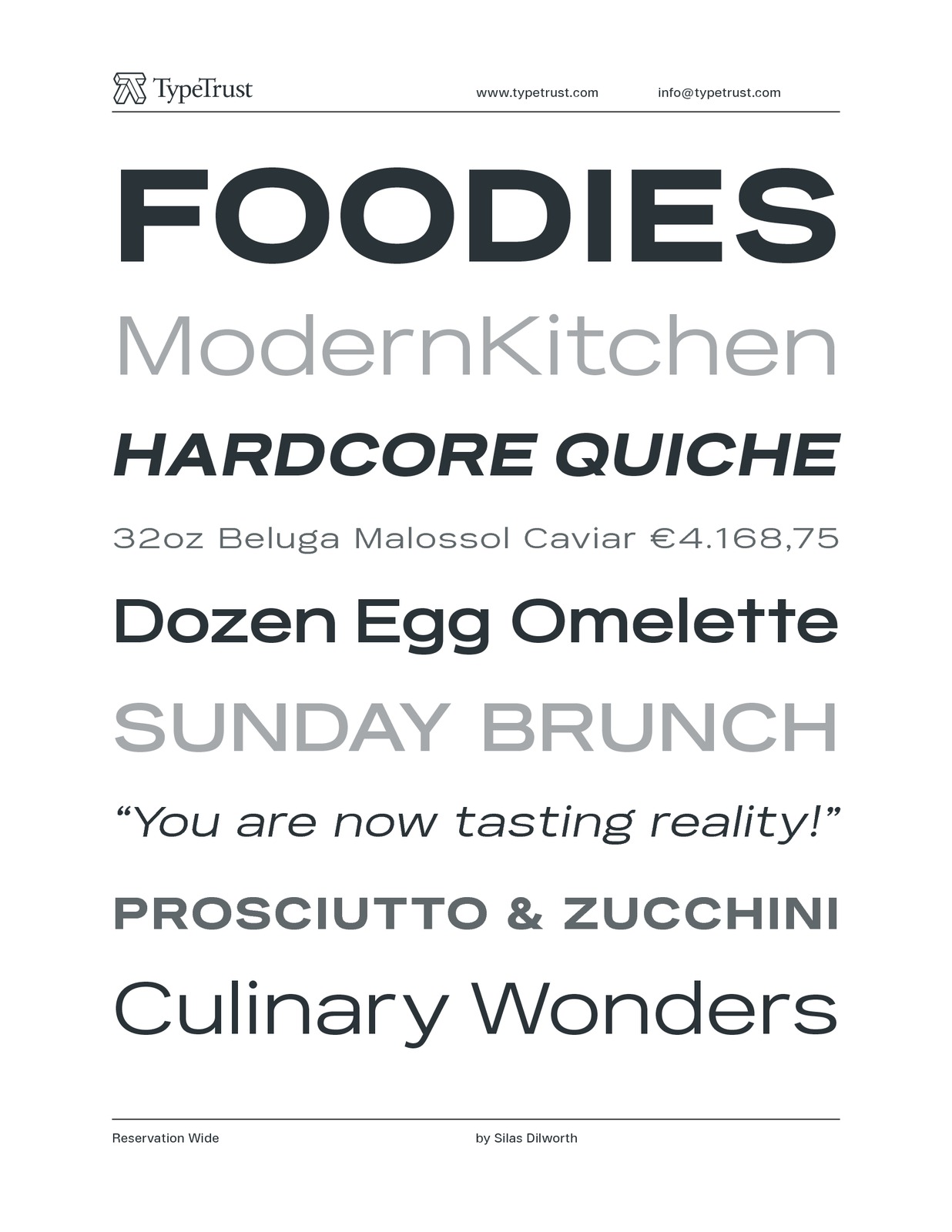
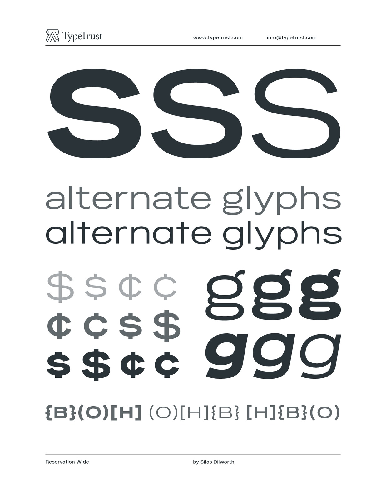
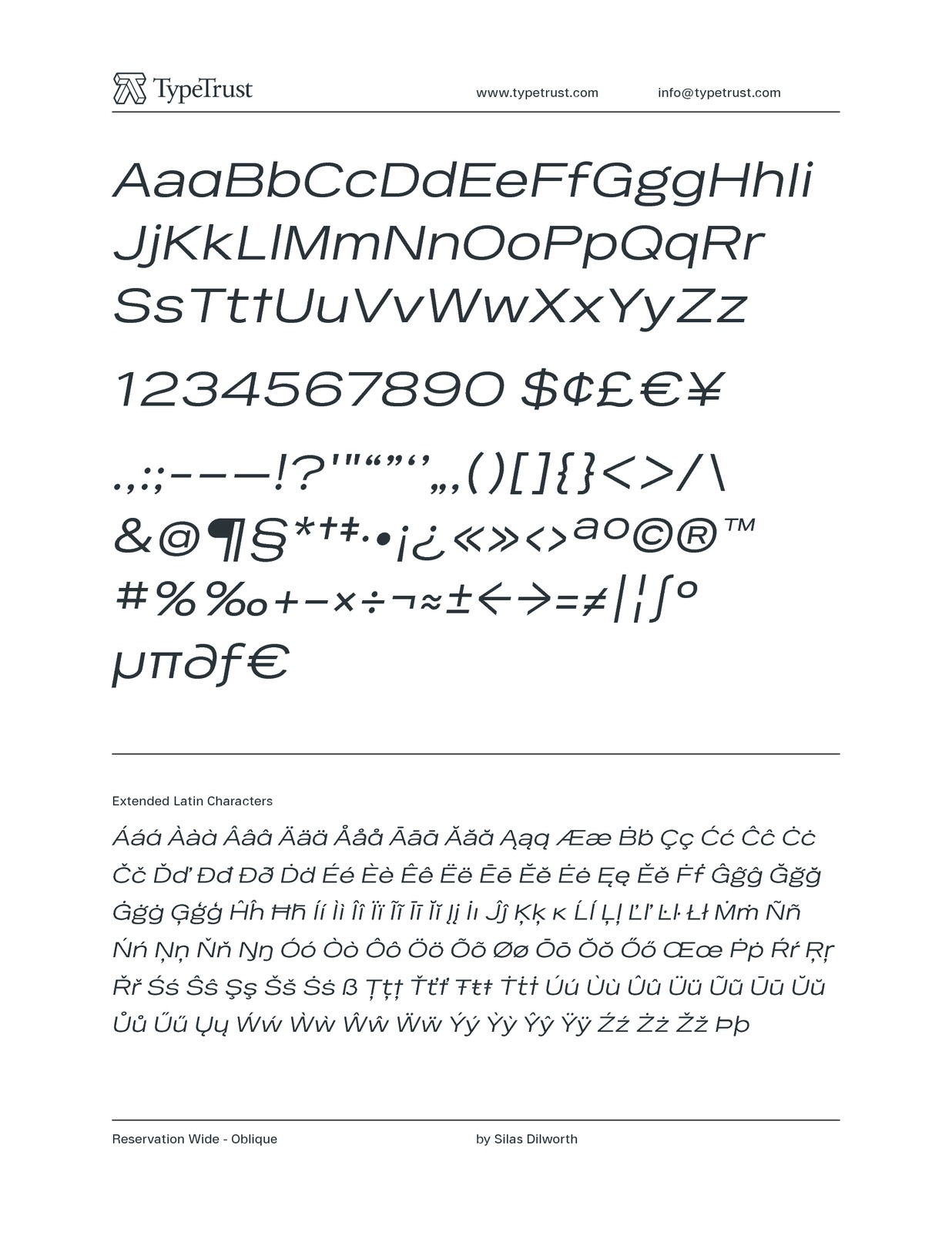
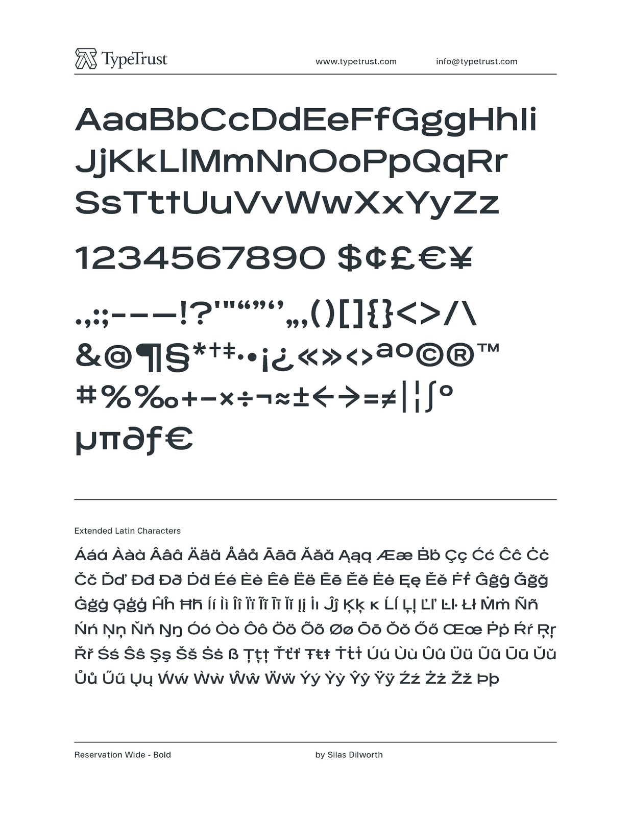
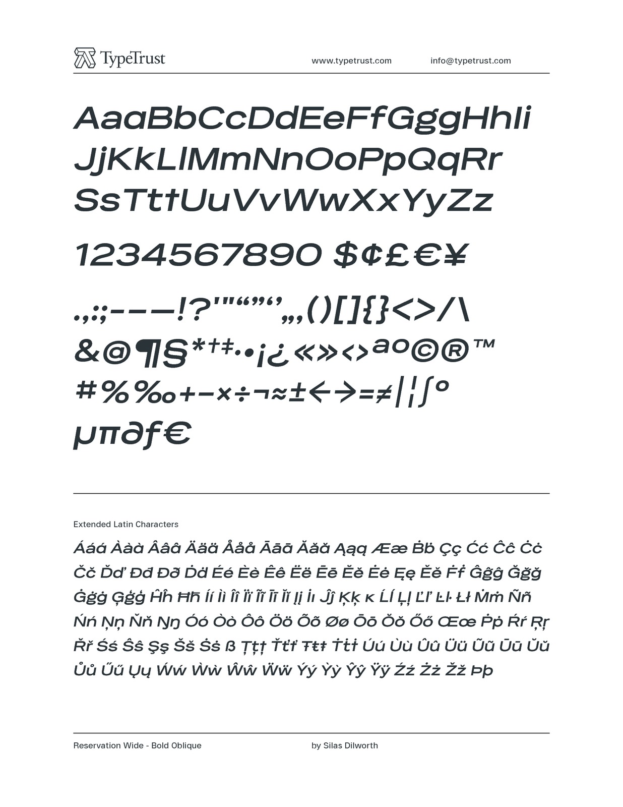
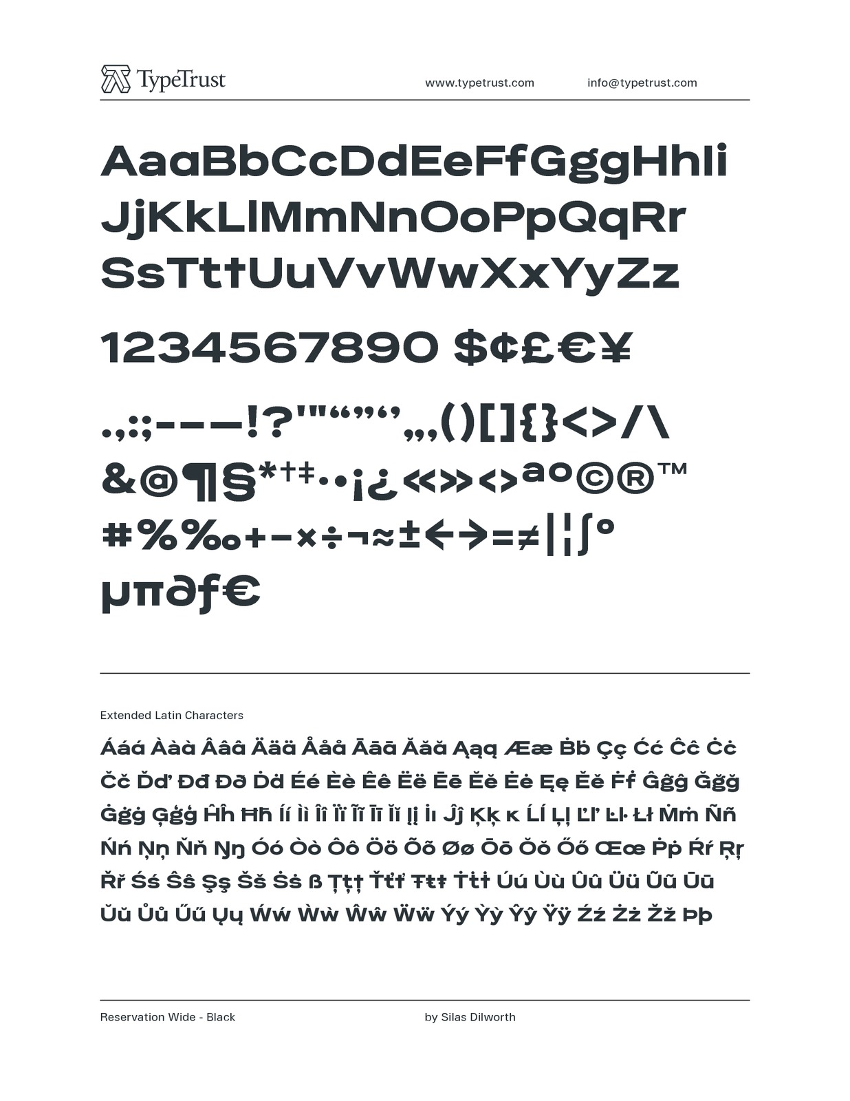
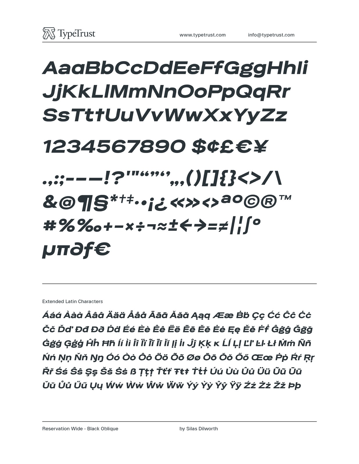
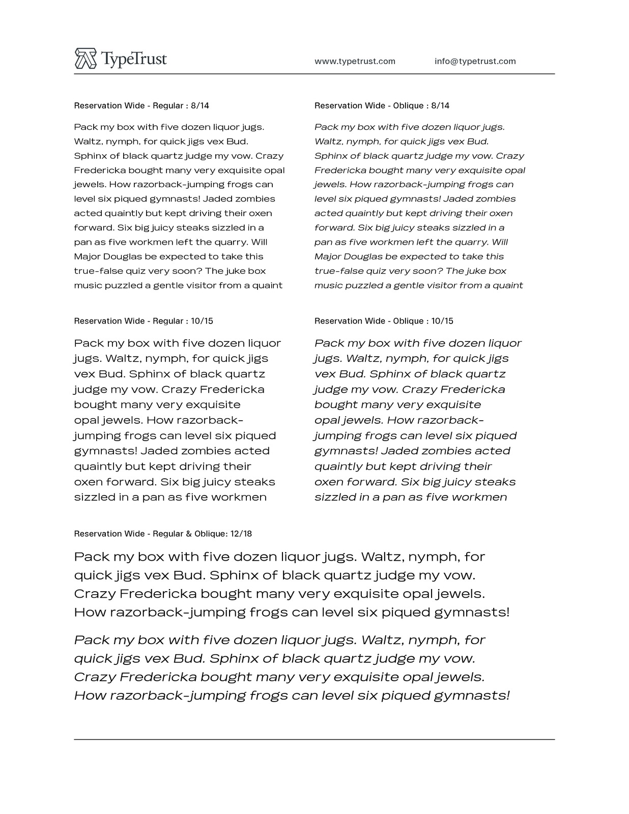
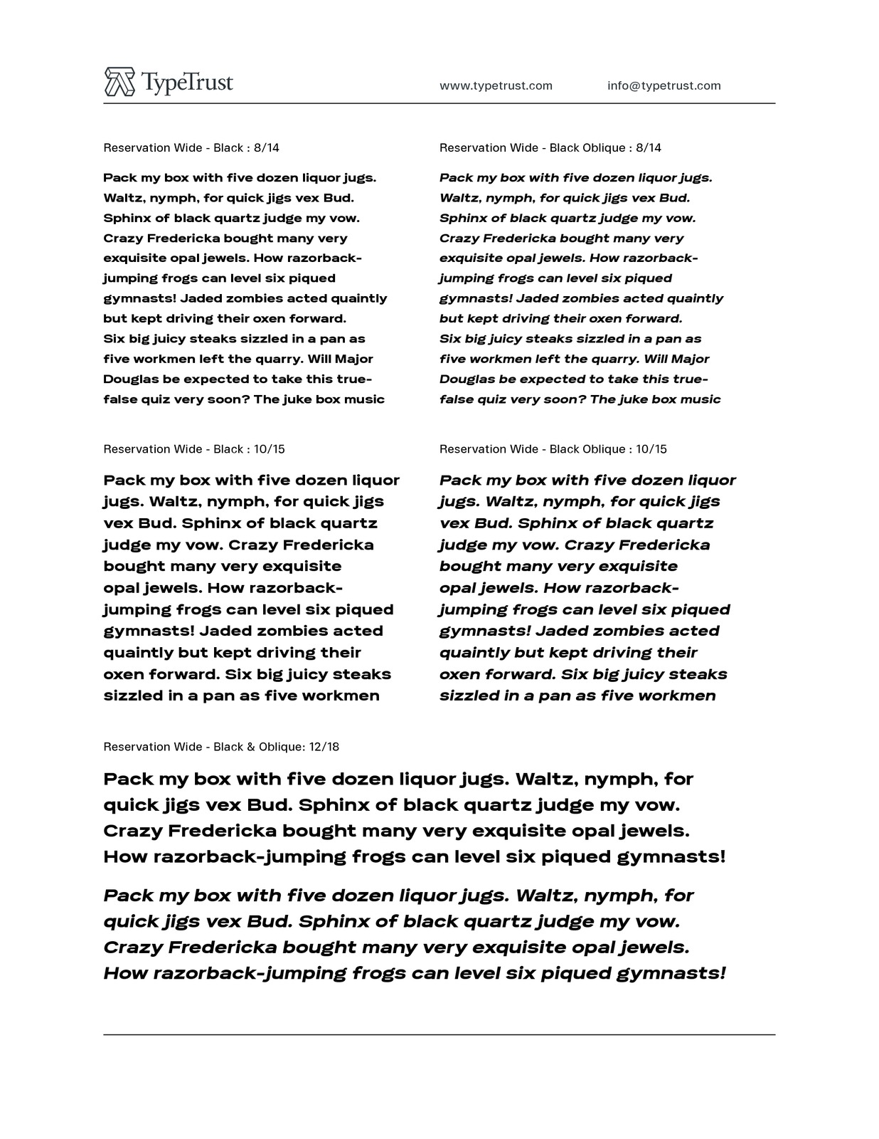
Reservation Wide is intended for headlines with its relatively snug letterspacing and extended forms. Its simplicity will accommodate smaller sizes and lower resolution displays. Opentype Stylistic Alternates for characters 'a', 'g' and 't' lend an even simpler finish.The hand-drawn curves and angled stroke endings temper the otherwise rigid proportions of the family. This painterly tendency becomes more apparent in the heavier weights keeping them from looking too imposing. I see the angles beginning to smile back with a sort of reserved, almost cheerful nonchalance.
The design first took shape as a custom font named Majestos for the cable channel The Food Network. It can be found in their growing online and printed presence in addition to their broadcast identity for which it was developed.
Published: May 24, 2006
Keywords: sans, simple, clean, extended, modern