Design:
Jean-Baptiste Levée.
Cyrillic:
Ilya Ruderman,
Yury Ostromentsky.
Greek:
Emilios Theofanous.
Team:
Yoann Minet,Hugues Gentile.
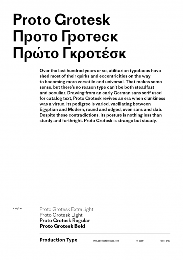
Over the last hundred years or so, utilitarian typefaces have shed most of their quirks and eccentricities on the way to becoming more versatile and universal. That makes some sense, but there’s no reason type can’t be both steadfast and peculiar. Drawing from an early German sans serif used for catalog text, Proto Grotesk revives an era when clunkiness was a virtue. Its pedigree is varied, vacillating between Egyptian and Modern, round and edged, even sans and slab. Despite these contradictions, its posture is nothing less than sturdy and forthright. Proto Grotesk is strange but steady.
Awards & distinctions
Type Directors Club New York Certificate of excellence 2015
Type Directors Club Tokyo Selection 2015
Hiii Typography Merit Award 优异奖 2014
Typecache best of 2014
Typo365 best of 2014
Typographica's favourite of 2014
Typefacts Best of 2014
Fontwerk Die besten Schriften 2014
Type Directors Club Tokyo Selection 2015
Hiii Typography Merit Award 优异奖 2014
Typecache best of 2014
Typo365 best of 2014
Typographica's favourite of 2014
Typefacts Best of 2014
Fontwerk Die besten Schriften 2014