Select this license type when you are developing an app for iOS, Android, or Windows Phone, and you will be embedding the font file in your mobile application's code.
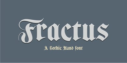
Fractus
by Eurotypo
Individual Styles from $36.00


Fractus Font Family was
designed by
Olcar Alcaide and
published by
Eurotypo. Fractus contains
1
styles.
More about this family
About Fractus Font Family
The requirements of Middle Ages scribes who copied and produced books in monasteries were fundamentally to preserve space, due to the high cost of the writing surface. During this long period of the development of Gothic forms, many other variations of the style of black letters appear: Textur or “Gothic-antique”, another group called Rotunda preferred by Italian and Spanish scribes. In 1490, the style "Bâtarde" (according to the the French classification) began to be widely used in Germany with more rounded shapes and named Scwabacher (probably derived from the city of Schwabach, but not certified) Fractur is a more condensed and narrower form than Schwabacher. This style is attributed to Johann Neudörfer of Nuremberg, cut in 1513; it was quickly imitated, therefore a few years later became to be a German national identity that extended over the next four centuries. The shape of its characters can be considered as a fusion of Texture and Schwabacher: the lowercase actually has medium strictly vertical and half curved strokes. The first expressions of the baroque influence this writing whose appearance of movement is due to the ornaments applied to the uppercase letters and the ascending and descending features of the lowercase. Despite having spent so many years and being a typeface not suitable for extensive reading texts, the Gothic Fractur has endured over time for possessing a strong and solid characteristic, as well as being closely linked to the spirit of gothic cathedrals of countries in northen Europe. In fact, it is probably that this expressive feature leads them to be chosen in the most varied graphic communication needs, which run from from banks and financial companies, insurers, law offices, publishers, newspapers and TV networks, till alcoholic drinks, funeral tombstones, packaging and even tattoos.
Designers: Olcar Alcaide
Publisher: Eurotypo
Foundry: Eurotypo
Design Owner: Eurotypo
MyFonts debut: Jul 19, 2019
Fractus

About Eurotypo
Eurotypo is a foundry established in 2004 by Carine de Wandeleer and Olcar Alcaide that focuses on research, design, and the production of new fonts. Originally formed in Santa Severa, Italy, the group has since moved its headquarters to Valencia, Spain. In Eurotypo we develop new and original typefaces inspired by both the models of ancient writing and the investigation of new forms of expression based on the communication function of typography. The group made its MyFonts debut with Antium, and has followed it up with bestsellers such as script faces Aleka and Juliette.
Read more
Read less