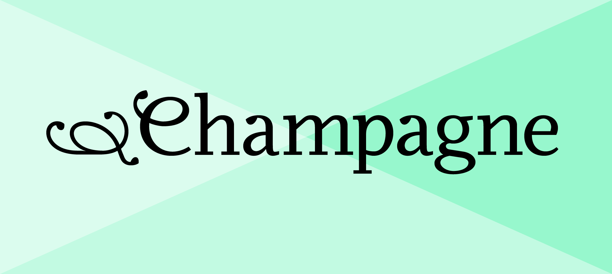
Odile
Odile Light
Odile Light Italic
Odile Book
Odile Book Italic
Odile Regular
Odile Italic
Odile Semibold
Odile Semibold Italic
Odile Bold
Odile Bold Italic
Odile Black
Odile Black Italic
Odile Upright Italic
Odile Initials
Odile Deco Initials
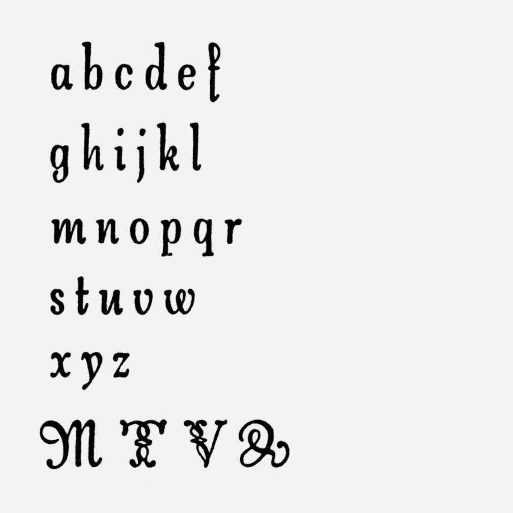
abcdefghyz
ijklmnop
qrst
uvwx
Language Support & Font Formats
Format Options
OTF, WOFF, WOFF2, EOT, TTF
Designer
Sibylle Hagmann
Initial Release
2006
Language Coverage
Extended Latin
Styles
16
Version Number
V 2.0 (revised in 2010)
Extended Latin character set covering the following languages:
Latin 1 – 6 (ISO 8859 – 1, 2, 3, 4, 9, 10): Afrikaans, Albanian, Basque, Bosnian, Breton, Catalan, Cornish, Croatian, Czech, Danish, Dutch, English, Esperanto, Estonian, Faroese, Finnish, French, Frisian, Friulian, Gaelic (Manx), Gaelic (Scottish), Galician, German, Hawaiian, Hungarian, Icelandic, Indonesian, Irish, Irish Gaelic, Italian, Karelian, Kurdish, Latin, Leonese, Latvian, Lithuanian, Luxembourgish, Maltese, Moldavian (Latin), Norwegian, Polish, Portuguese, Rhaeto-Romanic, Romanian, Sami, Serbian (Latin), Slovak, Slovenian, Sorbian, Spanish, Swahili, Swedish, Turkish, Welsh, Walloon
All Roman and Italic weights include the same set of glyphs.
Desktop Fonts
Desktop fonts are in OpenType (.otf) format.
Webfonts
Webfonts are provided for self-hosting in .woff, .woff2, and .eot formats. All styles currently offered have been screen hinted to work in sizes 16 pixels and larger.
Mobile App Fonts
Mobile app fonts are in TrueType (.ttf) format.
Odile
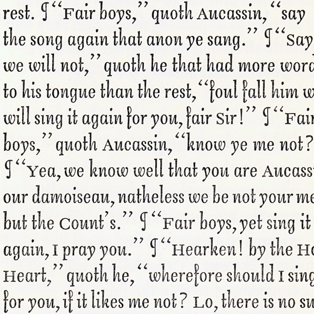
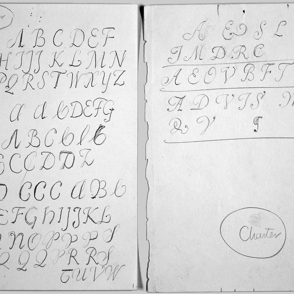
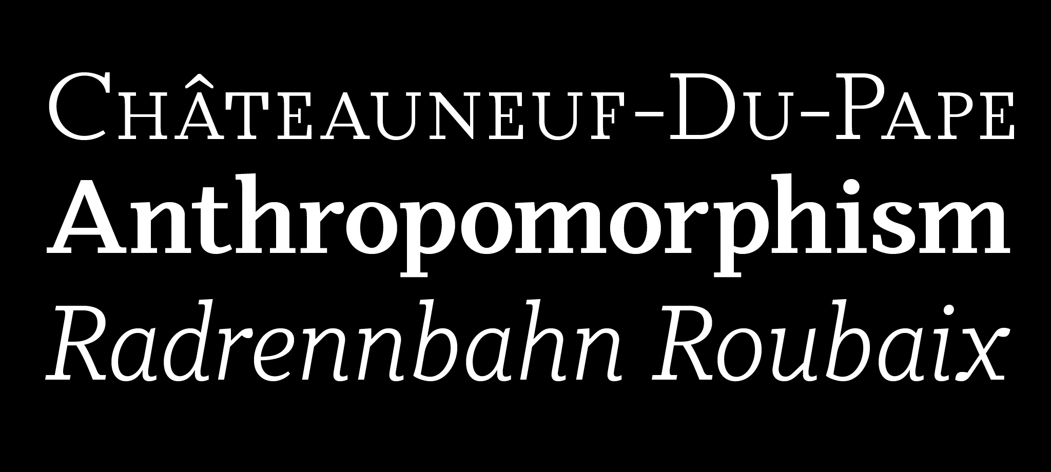
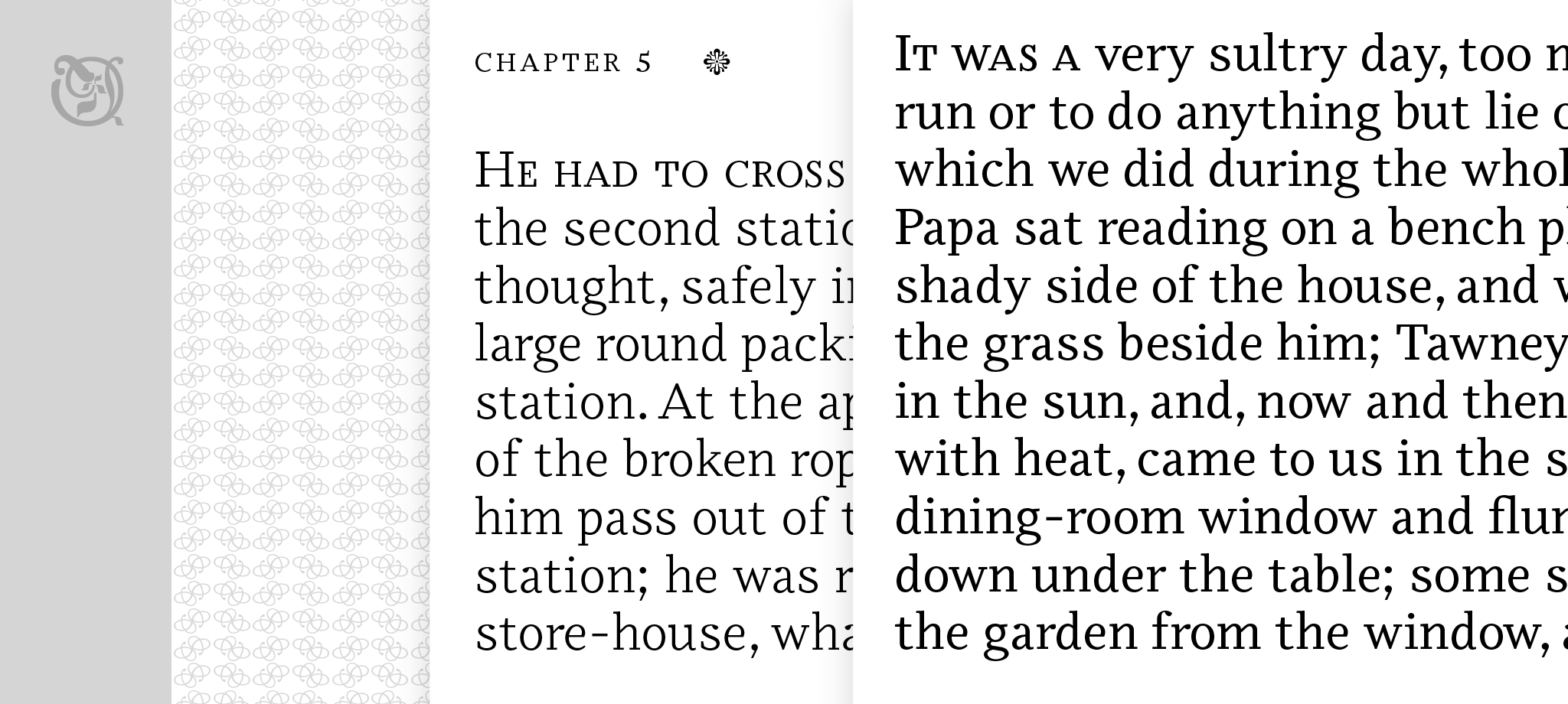
Odile™ is a text typeface with bracketed head and bracket-free bottom lower case serifs, a quality that counters rigidness most traditional slab serif typefaces possess. This contemporary design draws inspiration from an experimental typeface named Charter originally designed by the American book and type designer William Addison Dwiggins.
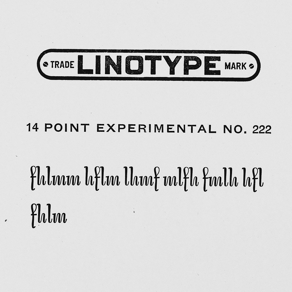
Dwiggins contemplated Charter as the italic companion to Arcadia, Experimental No. 221. The Charter project progressed sporadic, stalled during the Second World War, and came to a halt in 1955. Charter remained incomplete and was never commercially released. Assessing Charter’s whimsical design, its fragments were rethought and developed into a comprehensive text family.
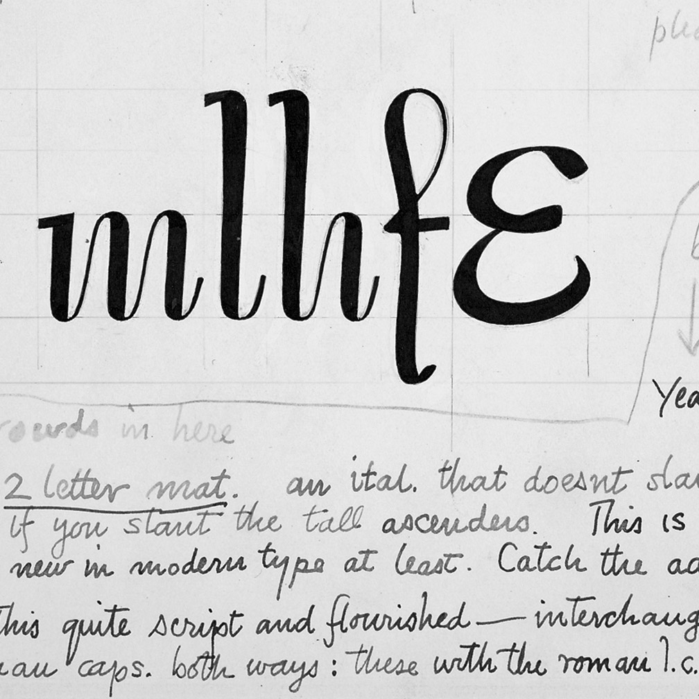
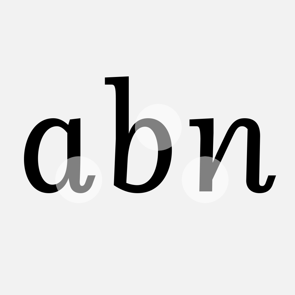
Odile Upright Italic reveals visible similarities shared by Dwiggins’ Charter and defines the design approach for the family. The steep calligraphic upstroke and low junctions off the stem as in the upright italic ‘h’ or ‘m’, are gradually lessened in the italic and moved up for the roman weights.
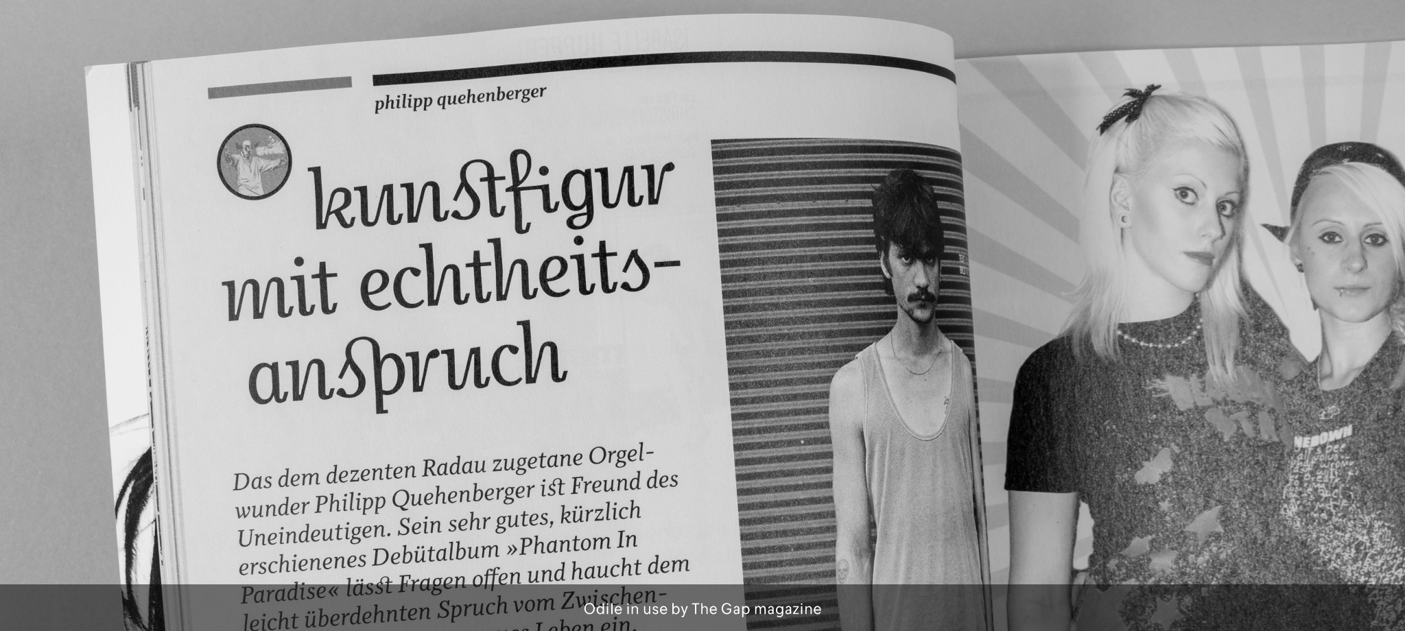
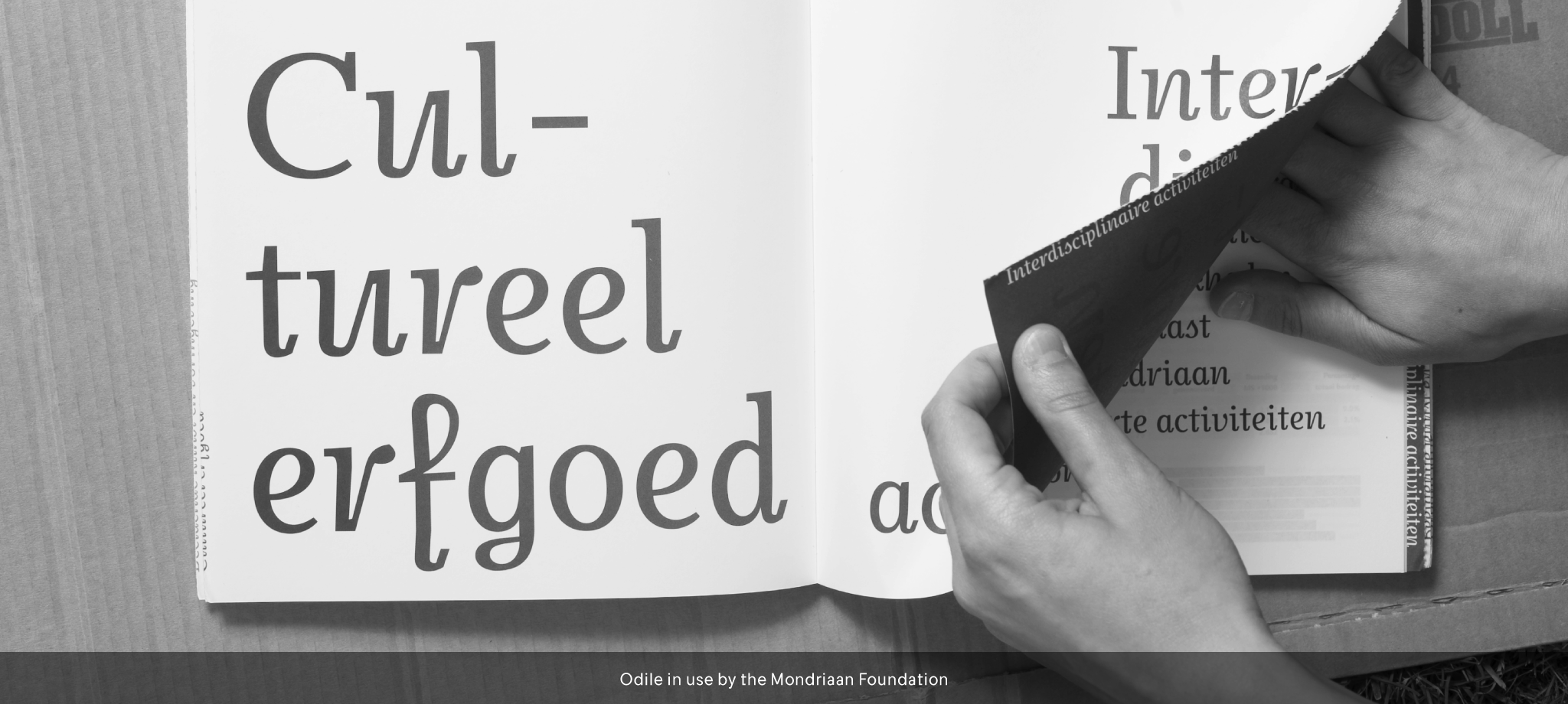
The six optically balanced weights range from the delicate Light to stark Black, accompanied by display variants with flowing flair and ardent ornaments. Two sorts of Initials, one amplified with interweaving swashes, the other more restrained, both are clearly derived from the Upright Italic. This mid-contrast serif offers a wide range of tools for text and display typography with a palette of strict to playful. The gracefully seriffed type harmonizes perfectly with Elido, Odile’s sans serif companion.