GT Super

Family overview
- Text
- Book Italic
- Regular Italic
- Medium Italic
- Bold Italic
- Black Italic
- Display
- Light Italic
- Regular Italic
- Medium Italic
- Bold Italic
- Super Italic
Subfamilies
- Display LightThe high performance machine, years ahead of the competition.
- Display Light ItalicGet hooked on the look and sold on the price. Simply Super.
- Display RegularIt’s finished off with a high regard for the decencies of life.
- Display Regular ItalicDecisions…decisions…make your decisions! GT Super!
- Display MediumLife’s too short to settle for anything less than the typeface you really want.
- Display Medium ItalicThe shape of things to come at a price you can afford today.
- Display BoldStyle isn’t something you can practice. It’s something you’re born with. Like GT Super. Very long, very thin, very elegant.
- Display Bold ItalicYour next typeface should look this great—you deserve it.
- Display SuperThe shape of things to come at a price you can afford today.
- Display Super ItalicDecisions…decisions…make your decisions! GT Super!
- Settings
Typeface information
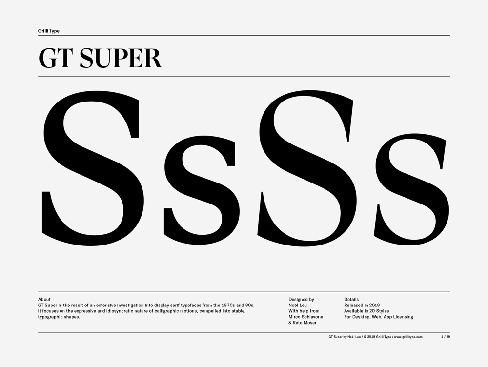
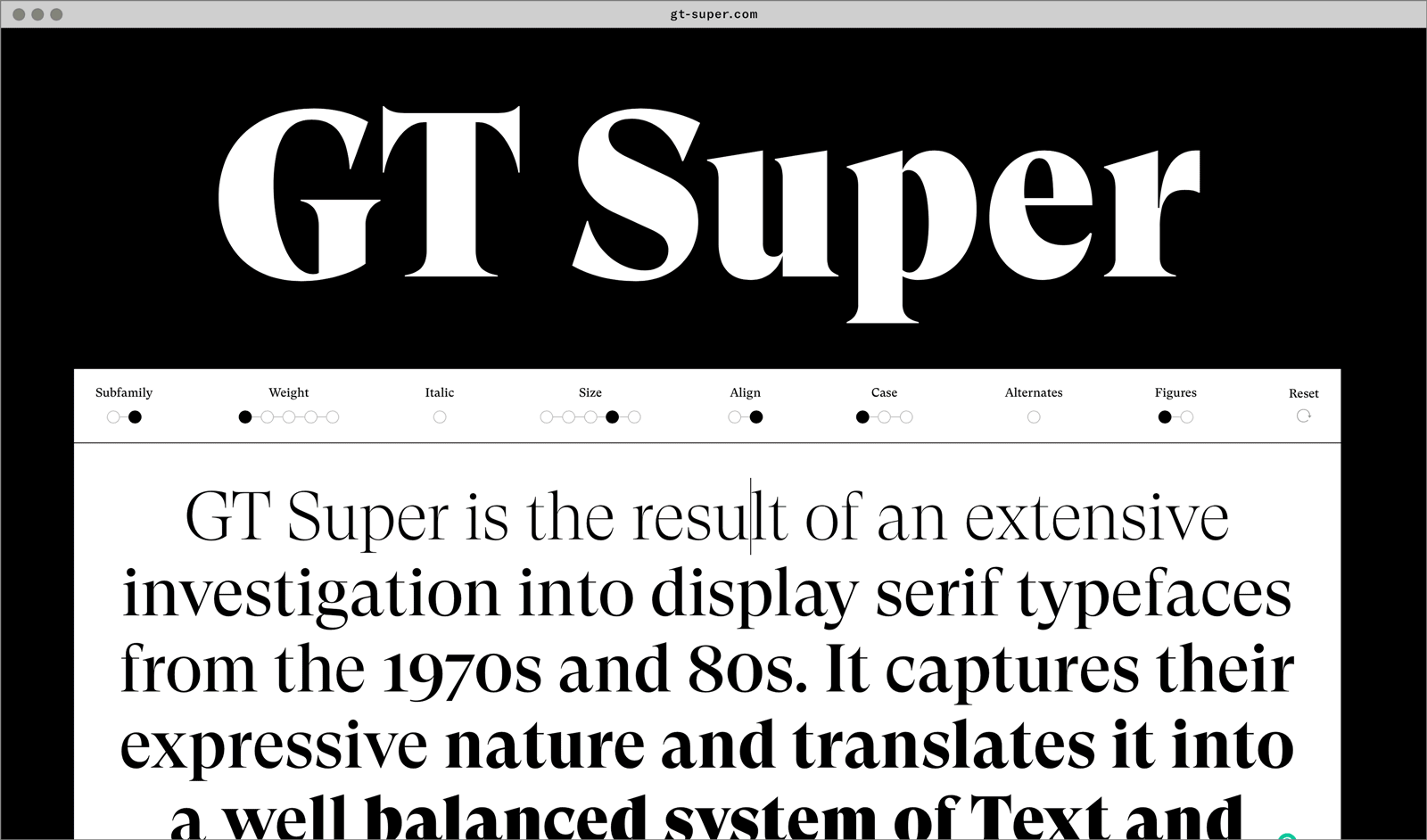
GT Super is the result of an extensive investigation into display serif typefaces from the 1970s and 80s. It focuses on the expressive and idiosyncratic nature of calligraphic motions, compelled into stable, typographic shapes.
- Designed by Noël Leu (Grilli Type) with help from Mirco Schiavone & Reto Moser
- Released in 2018
- Available in 20 styles
- GT Super is available for customization and language extensions
- Download the free trial fonts

Typeface features
OpenType features enable smart typography. You can use these features in most Desktop applications, on the web, and in your mobile apps. Each typeface contains different features. Below are the most important features included in GT Super’s fonts:
- SS01
- Alternates a, g, y
Lightrays
- SS05
- Alternate &
Kant & Mill
- LNUM
- Lining figures
0123456789
- SMCP
- Small Caps
Figuration
Typeface Minisite

- Visit the GT Super minisite to discover more about the typeface family’s history and design concept.
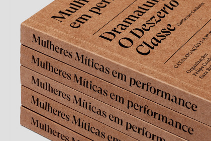
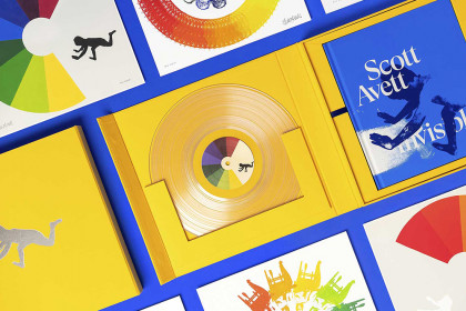
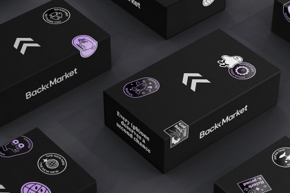
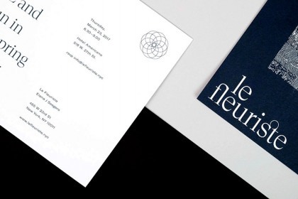
GT Super in use