Identifont

Fonts by Appearance

Fonts by Name

Fonts by Similarity

Fonts by Picture

Fonts by Designer/Publisher

Differences

TweetTweet Differences

Compare: and  

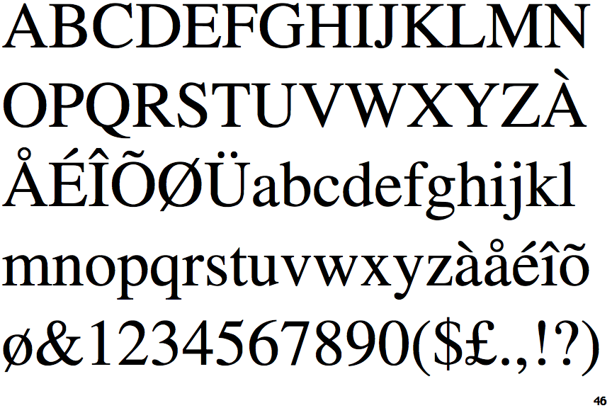
Times

Times

Double
The diagonal strokes of the upper-case 'K' meet in a 'T'.
Vertical
The serifs of the upper-case 'T' are both vertical or nearly vertical.

Note that the fonts in the icons shown above represent general examples, not necessarily the two fonts chosen for comparison.

Show Examples
Times New Roman

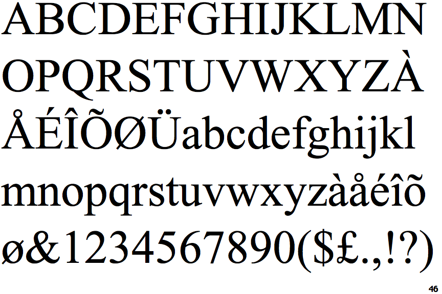
Times New Roman

Single
The diagonal strokes of the upper-case 'K' meet at the vertical (with or without a gap).
Different
The serifs of the upper-case 'T' are angled in opposite directions.