 |
The diagonal strokes of the upper-case 'K' meet at the vertical (with or without a gap).
|
 |
The centre bar of the upper-case 'P' leaves a gap with the vertical.
|
 |
The lower-case 'g' is double-storey (with or without gap).
|
 |
The lower-case 'a' stem curves over the top of the bowl (double storey).
|
 |
The top of the upper-case 'A' has no serifs or cusps.
|
 |
The centre bar of the upper-case 'R' leaves a gap with the vertical.
|
 |
The sides of the lower-case 'y' are angled (V-shaped).
|
 |
The junction of the upper-case 'K' leaves a visible gap with the vertical.
|
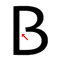 |
The centre bar of the upper-case 'B' leaves a gap with the vertical.
|
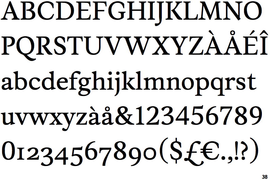
Note that the fonts in the icons shown above represent general examples, not necessarily the two fonts chosen for comparison.
Show Examples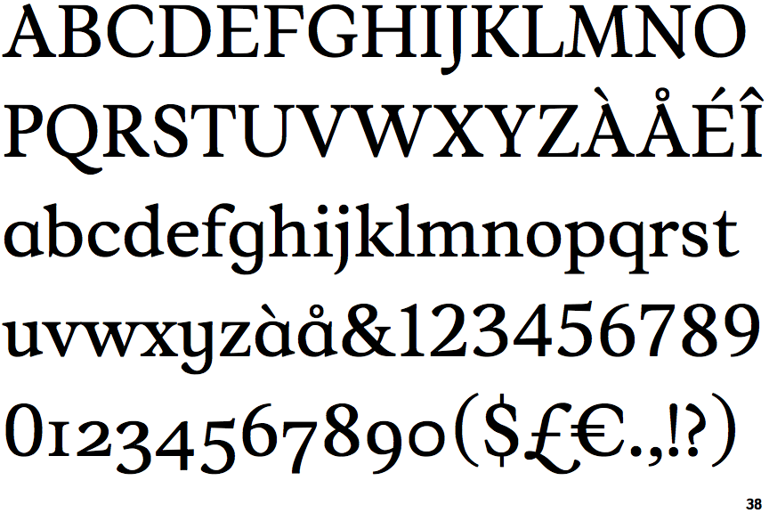
 |
The diagonal strokes of the upper-case 'K' connect to the vertical via a horizontal bar.
|
 |
The centre bar of the upper-case 'P' meets the vertical.
|
 |
The lower-case 'g' is single-storey (with or without loop).
|
 |
The lower-case 'a' stem stops at the top of the bowl (single storey).
|
 |
The top of the upper-case 'A' has a serif or cusp on the left.
|
 |
The centre bar of the upper-case 'R' meets the vertical.
|
 |
The sides of the lower-case 'y' are parallel (U-shaped).
|
|
The junction of the upper-case 'K' touches the vertical.
|
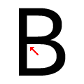 |
The centre bar of the upper-case 'B' meets the vertical.
|