 |
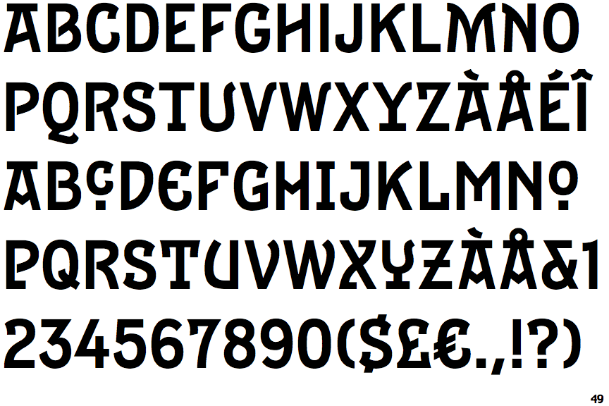
The '&' (ampersand) is traditional style with a gap at the top.
|
 |
The diagonal strokes of the upper-case 'K' meet in a 'T'.
|
 |
The top storey of the '3' is a sharp angle.
|
 |
The centre bar of the upper-case 'P' leaves a gap with the vertical.
|
 |
The upper-case 'Y' arms and tail are separate strokes.
|
 |
The centre bar of the upper-case 'E' has no serifs.
|
 |
The centre bar of the upper-case 'R' leaves a gap with the vertical.
|
 |
The centre vertex of the upper-case 'W' has no serifs.
|
 |
The centre bar of the upper-case 'F' has no serifs.
|
Note that the fonts in the icons shown above represent general examples, not necessarily the two fonts chosen for comparison.
Show Examples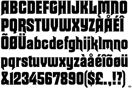
 |
The '&' (ampersand) is traditional style with two enclosed loops.
|
 |
The diagonal strokes of the upper-case 'K' meet at the vertical (with or without a gap).
|
 |
The top storey of the '3' is a smooth curve.
|
 |
The centre bar of the upper-case 'P' meets the vertical.
|
 |
The upper-case 'Y' right-hand arm forms a continuous stroke with the tail.
|
 |
The centre bar of the upper-case 'E' has serifs.
|
 |
The centre bar of the upper-case 'R' meets the vertical.
|
 |
The centre vertex of the upper-case 'W' has two separate serifs.
|
 |
The centre bar of the upper-case 'F' has serifs.
|