 |
The centre vertex of the upper-case 'M' is on the baseline.
|
 |
The lower-case 'g' is double-storey (with or without gap).
|
 |
The centre vertex of the upper-case 'W' has two separate serifs.
|
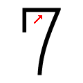 |
The top of the '7' is straight.
|
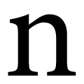 |
The lower-case 'n' feet have two serifs on each foot.
|
 |
The centre serif of the upper-case 'E' is vertical.
|
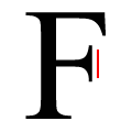 |
The centre serif of the upper-case 'F' is vertical.
|
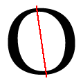 |
The axis of the upper-case 'O' is slanted to the left.
|
Note that the fonts in the icons shown above represent general examples, not necessarily the two fonts chosen for comparison.
Show Examples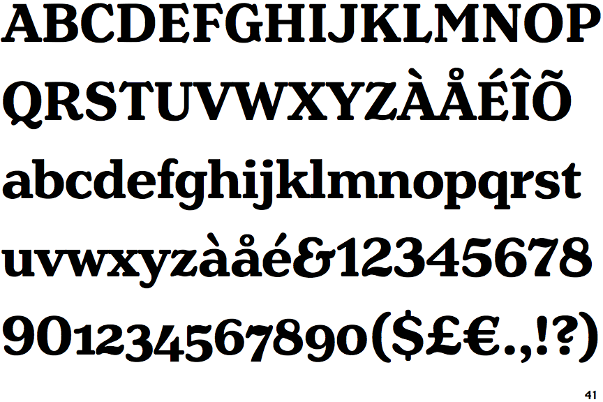
 |
The centre vertex of the upper-case 'M' is above the baseline.
|
 |
The lower-case 'g' is single-storey (with or without loop).
|
 |
The centre vertex of the upper-case 'W' has no serifs.
|
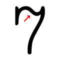 |
The top of the '7' is curved.
|
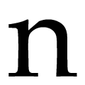 |
The lower-case 'n' feet have two serifs on the left and one on the right.
|
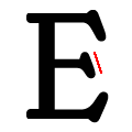 |
The centre serif of the upper-case 'E' is angled left.
|
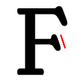 |
The centre serif of the upper-case 'F' is angled left.
|
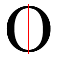 |
The axis of the upper-case 'O' is vertical or barely slanted.
|