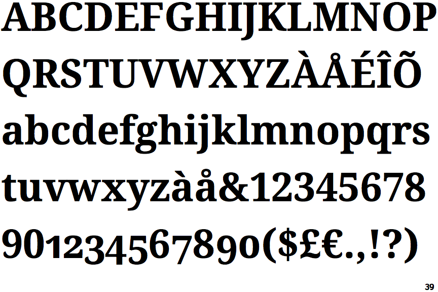
 |
The upper-case 'J' descends below the baseline.
|
 |
The centre bar of the upper-case 'E' has no serifs.
|
 |
The top of the lower-case 'q' has a right-facing serif.
|
 |
The tail of the upper-case 'J' has a tapered end.
|
 |
The feet of the lower-case 'h' have two serifs on the left and one on the right.
|
 |
The centre bar of the upper-case 'F' has no serifs.
|
 |
The upper-case 'C' is asymmetrical about a horizontal axis.
|
 |
The feet of the lower-case 'm' have two serifs on the left, and one on the centre and right.
|
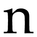 |
The lower-case 'n' feet have two serifs on the left and one on the right.
|
Note that the fonts in the icons shown above represent general examples, not necessarily the two fonts chosen for comparison.
Show Examples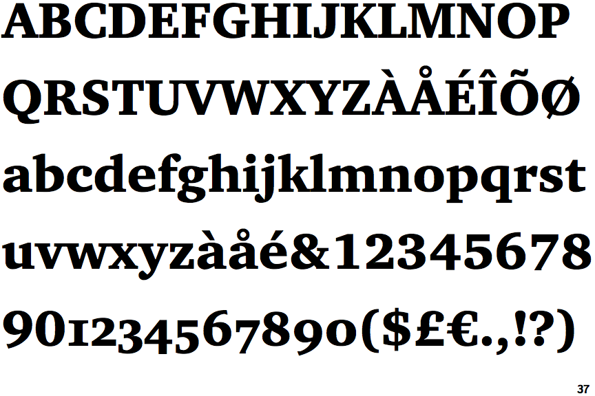
 |
The upper-case 'J' sits on the baseline.
|
 |
The centre bar of the upper-case 'E' has serifs.
|
 |
The top of the lower-case 'q' has no spur or serif.
|
 |
The tail of the upper-case 'J' has a flat end or cusp.
|
 |
The feet of the lower-case 'h' have two serifs on each foot.
|
 |
The centre bar of the upper-case 'F' has serifs.
|
 |
The upper-case 'C' is symmetrical about a horizontal axis.
|
 |
The feet of the lower-case 'm' have two serifs on each foot.
|
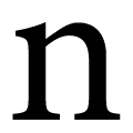 |
The lower-case 'n' feet have two serifs on each foot.
|