Identifont

Fonts by Appearance

Fonts by Name

Fonts by Similarity

Fonts by Picture

Fonts by Designer/Publisher

Differences

TweetTweet Differences

Compare: and  

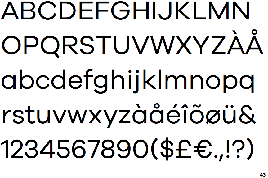
Galano Grotesque

Galano Grotesque

Touches
The upper-case 'Q' tail touches the circle.
Open
The '&' (ampersand) is traditional style with a gap at the top.
Parallel
The verticals of the upper-case 'M' are parallel.
Stem
The lower-case 'u' has a stem/serif.

Note that the fonts in the icons shown above represent general examples, not necessarily the two fonts chosen for comparison.

Show Examples
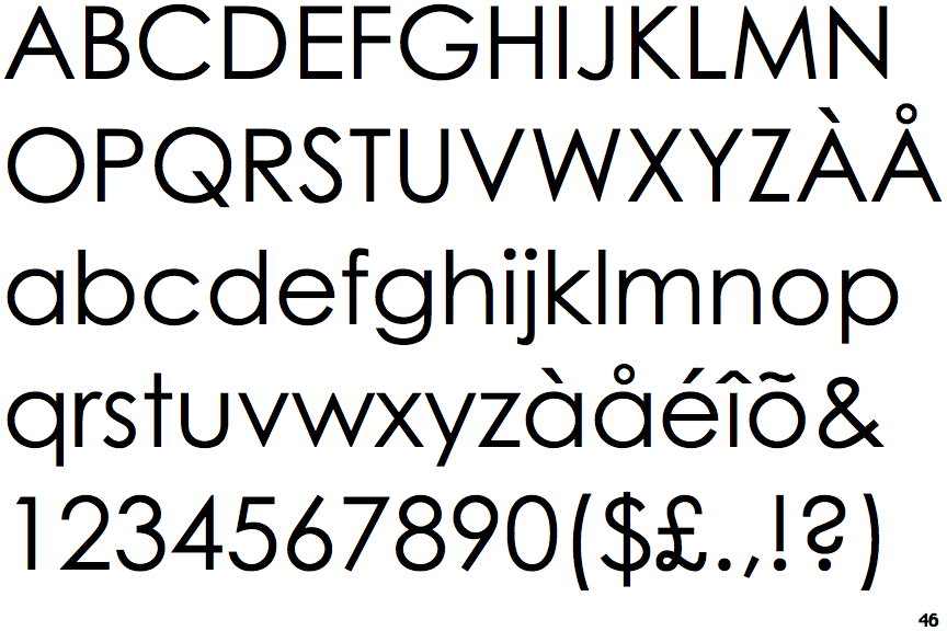
Century Gothic

Century Gothic

Crosses
The upper-case 'Q' tail crosses the circle.
Closed
The '&' (ampersand) is traditional style with two enclosed loops.
Sloping
The verticals of the upper-case 'M' are sloping.
No-Stem
The lower-case 'u' has no stem/serif.